Internship Project | BharatPe | January' 24 - May' 24
Kuber Design System

Part 01
Laying Out the Puzzle
Context about BharatPe
Context about BharatPe
In January’24, I joined BharatPe as a Product Design intern and majorly worked on developing a cohesive design system across all their products. BharatPe, a prominent fintech company founded in 2018, specializes in digital payment solutions and business loans for small and medium-sized merchants in India. The company's innovative platform includes QR code-based payments, UPI transactions, POS systems like BharatSwipe, and consumer products like PostPe, 12% Club, and Zillion (formerly PAYBACK).

Part 02
Sorting the Pieces
Problem Identified
Problem Identified
BharatPe's diverse applications faced design inconsistencies and usability issues, leading to a fragmented user experience and reduced engagement. Creating a unified design system was crucial.
BharatPe's diverse applications faced design inconsistencies and usability issues, leading to a fragmented user experience and reduced engagement. Creating a unified design system was crucial.
Scope and Considerations
Scope and Considerations
The project aimed to achieve consistency, efficiency, and scalability across BharatPe's diverse range of products.
As the sole designer on this initiative, I had to strategically balance immediate needs with long-term scalability goals.
Collaborating closely with the Head of Design, Sanjeev Kumar, we emphasized learning and competitive benchmarking to ensure our design system was both innovative and user-centric.
The project aimed to achieve consistency, efficiency, and scalability across BharatPe's diverse range of products. As the sole designer on this initiative, I had to strategically balance immediate needs with long-term scalability goals. Collaborating closely with the Head of Design, Sanjeev Kumar, we emphasized learning and competitive benchmarking to ensure our design system was both innovative and user-centric.
Process
Process
The process wasn't a rigid sequence of steps but rather a dynamic problem-solving journey
Much like putting together a jigsaw puzzle
Each piece played a crucial role in shaping the final outcome
The process wasn't a rigid sequence of steps but rather a dynamic problem-solving journey Much like putting together a jigsaw puzzle Each piece played a crucial role in shaping the final outcome

Part 03
Building the Frame
5W1H Approach
5W1H Approach
To thoroughly explore the essential elements of design systems
Addressed the who, what, when, where, why, and how aspects.
To thoroughly explore the essential elements of design systems Addressed the who, what, when, where, why, and how aspects.

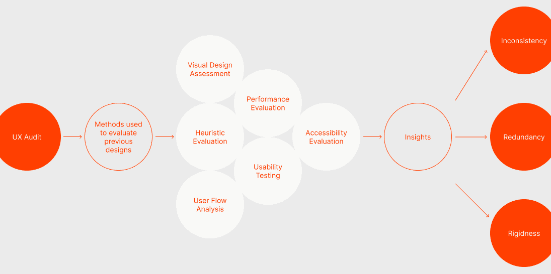
UX Audit
UX Audit
To identify inconsistencies and areas needing improvement
Audited product components across different BharatPe apps
To identify inconsistencies and areas needing improvementAudited product components across different BharatPe apps
Insights
Inconsistency: Significant variations in design elements across products.
Redundancy: Extra time spent by designers and developers due to the absence of a standardized component library.
Rigidness: Lack of a clear structure for interactive elements, hindering flexibility.
Insights
Inconsistency: Significant variations in design elements across products.
Redundancy: Extra time spent by designers and developers due to the absence of a standardized component library.
Rigidness: Lack of a clear structure for interactive elements, hindering flexibility.
Benchmarking Industry Standards
Benchmarking Industry Standards
Constantly took inspiration from industry standards
Benchmarked our findings by analyzing the documentation, guidelines, and components of leading design systems
Constantly took inspiration from industry standards
Benchmarked our findings by analyzing the documentation, guidelines, and components of leading design systems

Finalizing Core Components
Finalizing Core Components
Decided on the core components necessary for building a cohesive and scalable design system
Decided on the core components necessary for building a cohesive and scalable design system


Part 04
Connecting the Dots
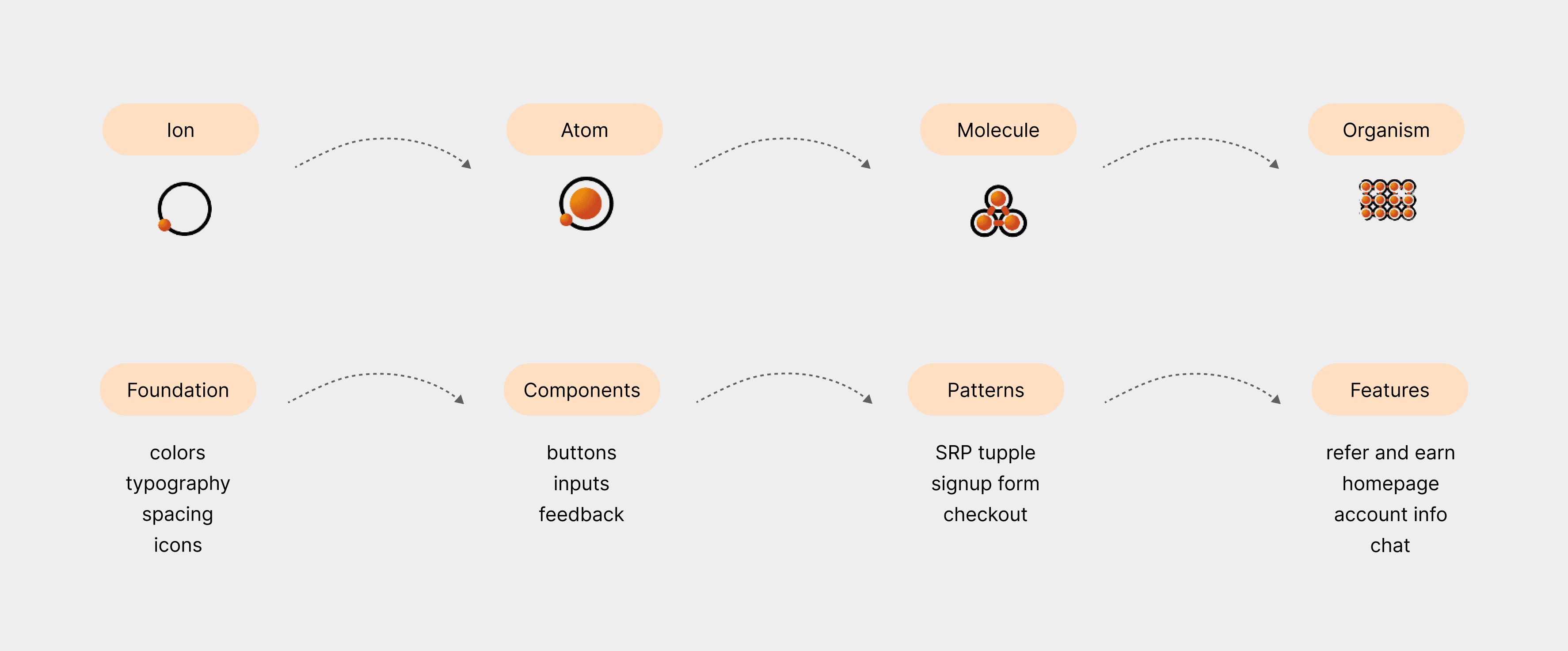
Atomic Design
Atomic Design
To create a scalable and modular design system, we embraced atomic design principles, which break down user interfaces into smaller, reusable components called atoms, molecules, organisms, and beyond.
This approach facilitated consistency and flexibility across design and development processes.
To create a scalable and modular design system, we embraced atomic design principles, which break down user interfaces into smaller, reusable components called atoms, molecules, organisms, and beyond.
This approach facilitated consistency and flexibility across design and development processes.
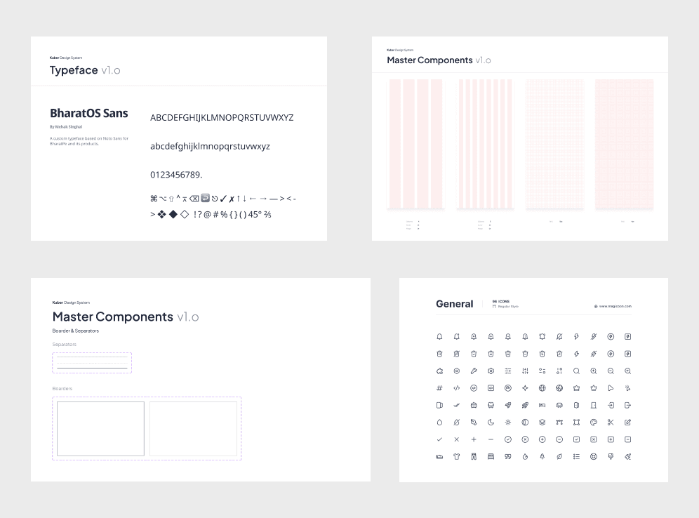
Laying Foundation
Laying Foundation
Drew inspiration from well established design systems
Held meetings everyday with the design team to get their approval and feedback
Created a custom font named BharatOne
Aimed to encapsulate a modern, vibrant brand while also considering the emotional state of the end users
From color palette to UX microcopy provide a sense of stability and assurance
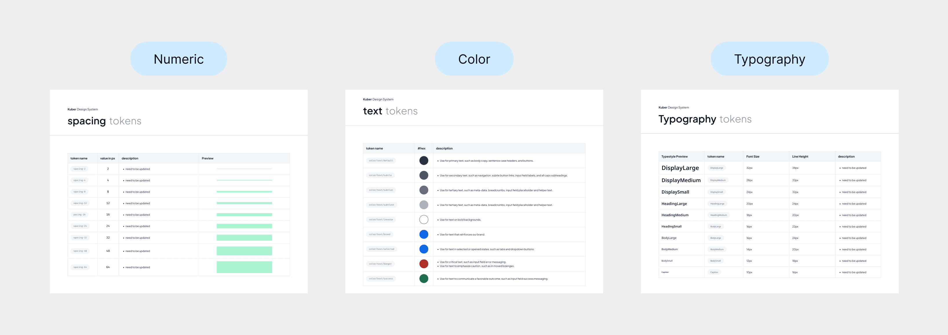
Defining Tokens
Defining Tokens
played a crucial role in maintaining consistency and scalability throughout BharatPe’s design system
played a crucial role in maintaining consistency and scalability throughout BharatPe’s design system
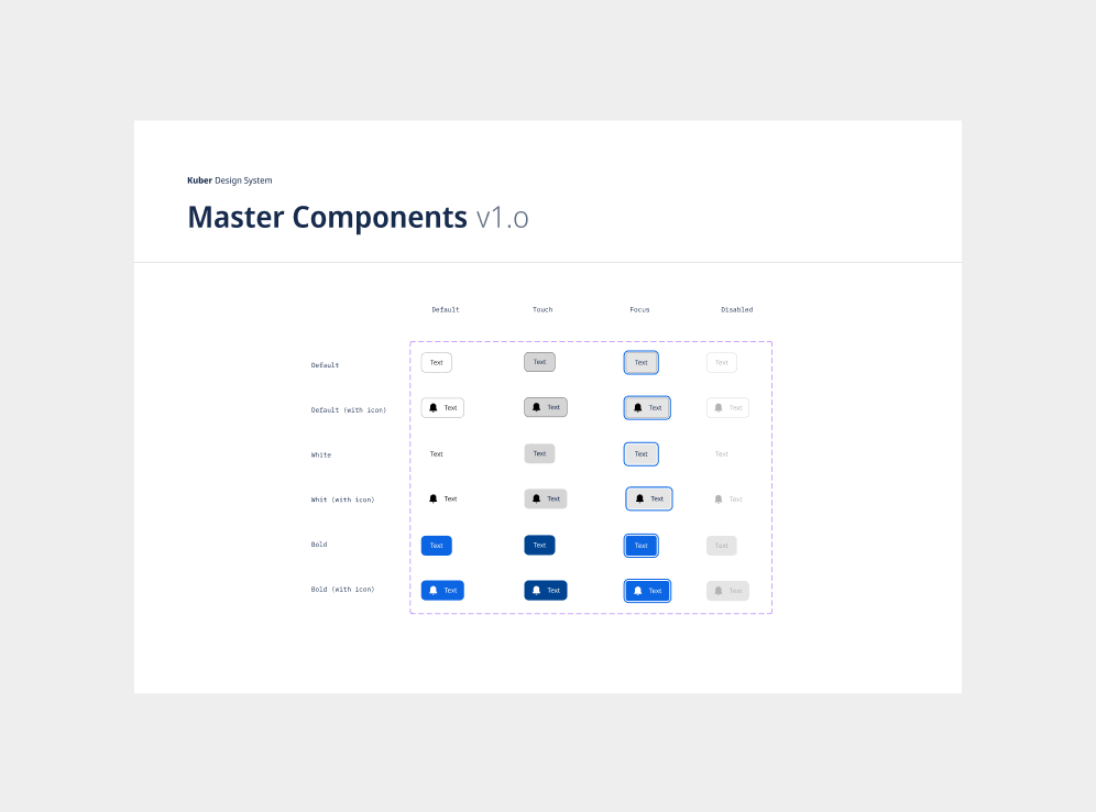
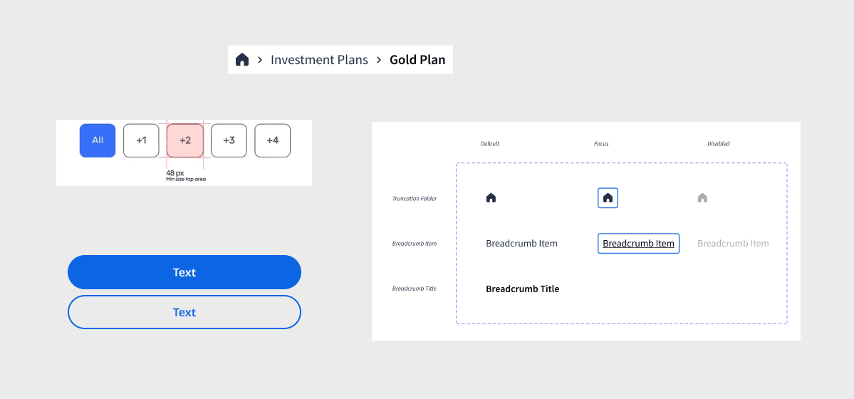
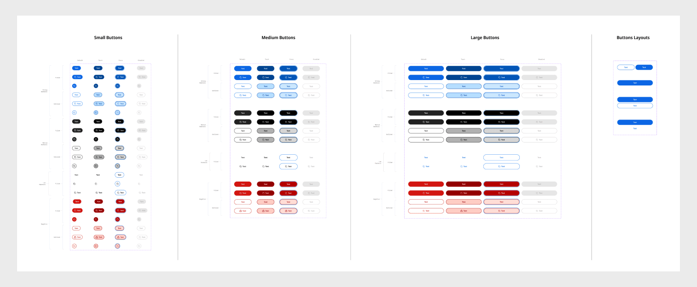
Component Library
Component Library
Main body of the design system
consisted of reusable UI element
started by listing all the main categories and what we could add in each category
this part will always be under construction
Main body of the design system
consisted of reusable UI element
started by listing all the main categories and what we could add in each category
this part will always be under construction
Part 05
Capturing the Picture
Accessibility
Accessibility
Checking color contrast on different background and across different interaction states
Ensuring font size + touch targets on mobile are appropriate
Including text labels with icons on mobile navigation
Consistency across layouts and similar UI elements
Checking color contrast on different background and across different interaction states
Ensuring font size + touch targets on mobile are appropriate
Including text labels with icons on mobile navigation
Consistency across layouts and similar UI elements
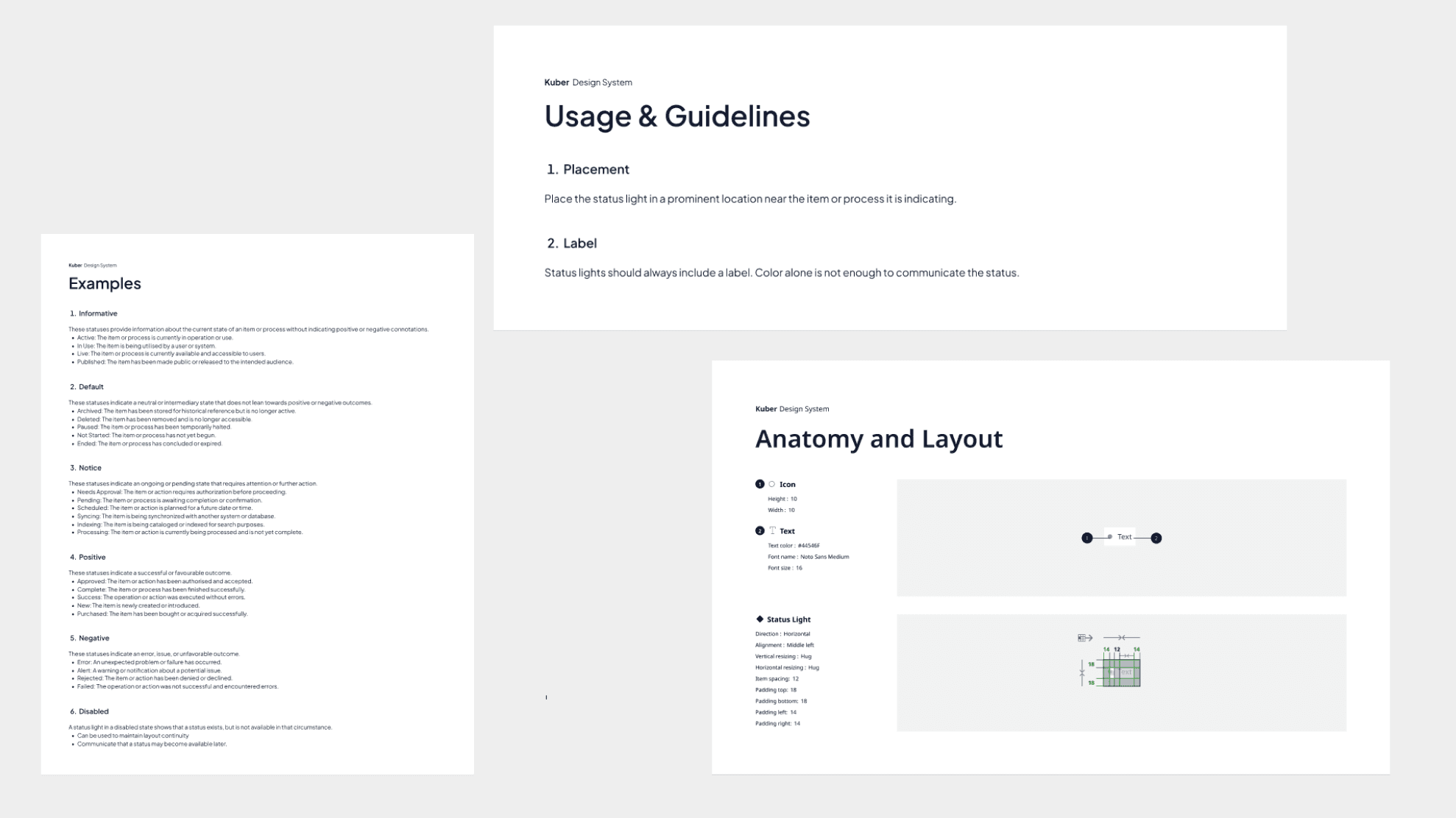
Documentation and Guidelines
Documentation and Guidelines
Provided rationale and explain the reasoning behind design decisions.
Anatomy to break down components and their purposes.
Usage examples to illustrate how components should be used in various contexts.
Showcase interactions and states with detail component behaviors and states.
Cite research and data to support design decisions.
Organizing the system
Organizing the system
essential for the design system to be effective
categorizing components and patterns logically
making them easy to find and use
A clear naming convention was adopted to ensure consistency
essential for the design system to be effective
categorizing components and patterns logically
making them easy to find and use
A clear naming convention was adopted to ensure consistency
Before and After
Before and After


A heartfelt thanks to BharatPe and especially its design team!
A heartfelt thanks to BharatPe and especially its design team!
